
Monday, 17 December 2012
Exhibit This Logo Sheet
Monday, 26 November 2012
Super Mario Bros. Pixel Art
I tested this effect as part of my final design is using an old pixelated Super Mario, though the choice is limited so it would be helpfull to learn how to create the pixel effect on a newer picture of Super Mario as the choice for pictures of the new Super Mario is high.
Overall, in my final design I think that I will be using this effect, as it gives me a wider range of choice for which Super Mario that I would like to use in my final design as it will look better because it will fit more.
Wednesday, 21 November 2012
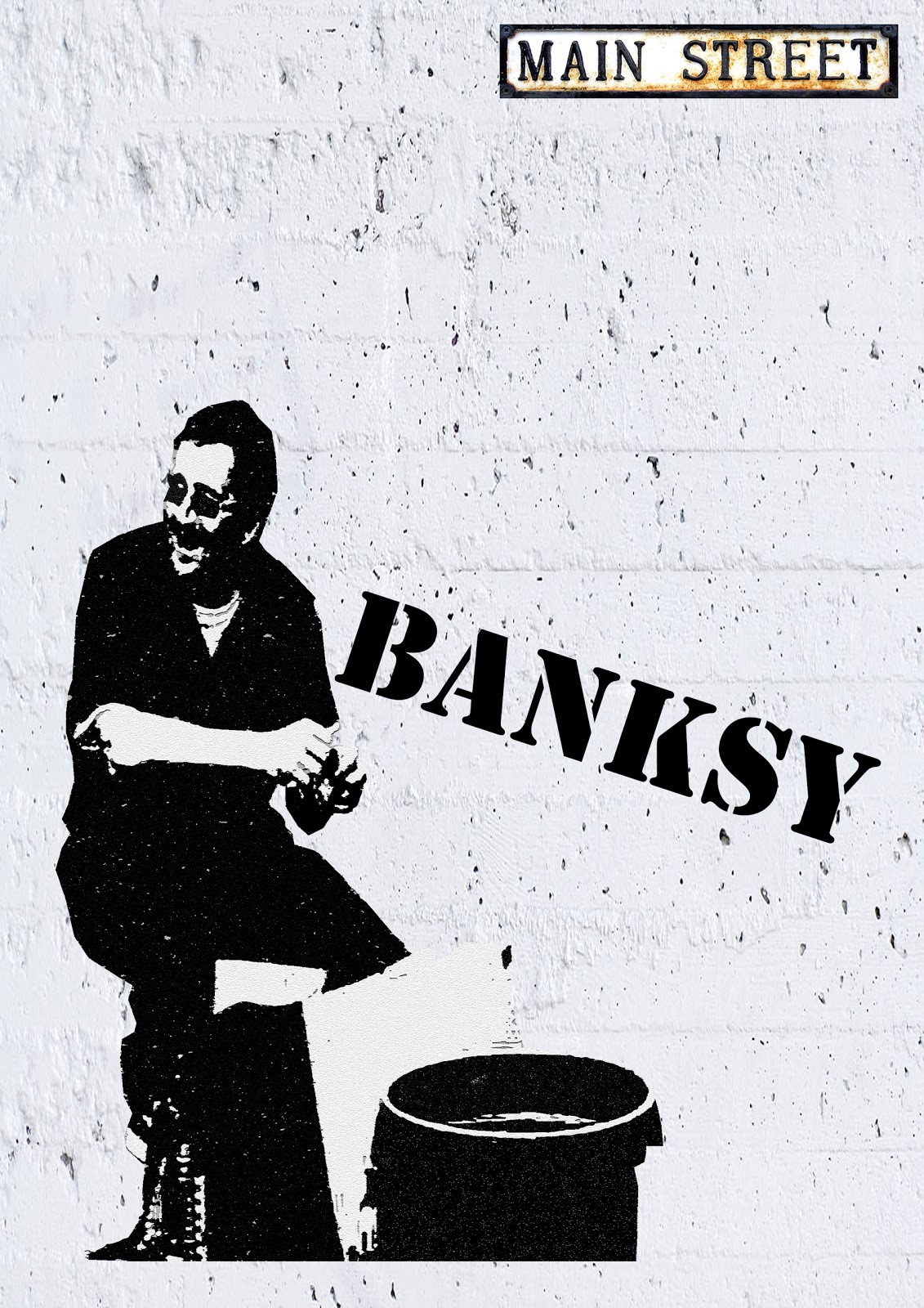
 In this photo I have used a range of effects to create a realistic looking piece of street art entirely on Adobe Photoshop. I started off by selecting the original image and cropping around the things that I wanted to use by using the Polygon Lasso Tool. Next, I went onto Filter Gallery and added the Note Paper effect; the effect which I have used to create the silhouette. I then got a picture of a white wall from Google Images and set it as the background and also added the text by using the Text Tool. A significant part of the image is the street name at the top. The street name "Main Street" has been used because of Banksy's career. This is because when he first started he was alone and was technically a criminal whereas now, his work is worth thousands and has even been purchased by celebrities such as Christina Aguilera. The street name ties is because of the phrase "main stream" and the street name "main street". I have done this as a practise for my final design as they tie together.
credit to: alarm-magazine.com for the original image of Banksy.
Wednesday, 7 November 2012
Effects on PhotoShop
I started off by saving a picture of an old pixelated Super Mario. I then split the picture into four sections by pressing Ctrl + R to show rules on the image. I then used the Rectangular Marquee Tool to select one of the squares and then put an effect on it. Next I went onto the filter gallery to try out some effects. I continued to do this another 2 times so that I could test some more effects. The effects I tried out have been listed on the picture. I tried out all of these effects to see if there were any that I would consider using in my final design.

Tuesday, 23 October 2012
Techniques
In the last couple of lessons I have been trying out a few different techniques which I could possibly use for my final design.
One of the techniques I tested was chalk on black card. I enjoyed this because (despite not being very good at it) I thoroughly enjoy drawing and this was very similar. I liked how I could be lazy with my shading in and it could still look good because when you use your fingers to rub the chalk it is a lot more effective than doing it with pencil. I decided to do Super Mario's head and the top half of his body. It looked alright when I had finished because I used the chalk effectively by rubbing it with my finger and using several colours in my design.
Another technique I tried out was drawing with charcoal. I found this even more like drawing with pencil so I enjoyed this also. Once again I drew a picture of Super Mario but this time I drew his whole body shooting out of a pipe. I drew my picture on an A3 piece of paper so that I could add more drawings next to it although I didnt get round to it as I had other techniques to try out.
The final technique I tried was the most enjoyable of all. It was printing paint on sheets of paper using polystyrene squares. I did this by getting a picture of Super Mario and resting it on top of the polystyrene square. I then drew around the lines and when I lifted the sheet of paper up it had carved a small silhouette of Super Mario being fired out of pipe once more. The outcome was alright but I would like to try out creating the same effect using Photoshop so that I have more control over what the final outcome will look like.
In conclusion I doubt that I will be using any of these techniques in my final design because despite enjoying them a lot, I'm just not very good. So I will hopefully create my idea using many different editing techniques on Adobe Photoshop.
Wednesday, 10 October 2012
Research
My final design consists of Pixel Art, Street Art & Graffiti. The artists that I have researched for these styles of art are Paul Robertson and Banksy. I will need to research Paul Robertson because he is style of art is Pixel Art, I will need this to create the Super Mario in my final design. I have already done a quick drawing of Super Mario in my sketch pad that is not pixelated. I will be making the pixel art Mario on my computer after watching tutorials on how to do pixel art and also after I have done more research on it. I researched Banksy as one of the main things in my final design is Street Art. Banksy is possibly the UKs most famous Street Artist/Graffiti Artist. I have taken a picture of a brick wall and printed it off because this will be the background of my final design.
Thursday, 27 September 2012
Final Design
After weeks of deciding what my final design will be about I have came to a conclusion. My final design will be contrasting fantasy with reality using street art and pixel art with a message in it. I will be researching two artists; one pixel artist and one street artist. The two artists will be Banksy(street/graffiti artist) and Paul Robertson(pixel artist). Researching Banksy was quite easy as he is an extremley famous artist though, researching Paul Robertson was hard because it is a very common name and he is not that famous. Also in some of Paul Robertsons work he uses nudity so I was unable to access a lot of websites that would give me information on him.
Thursday, 6 September 2012
Ripple


Wednesday, 5 September 2012
Subscribe to:
Comments (Atom)